
You Could Be Losing 25% or More of Your Website Visitors
One of the easiest mistakes to make when marketing your business is to fall into the trap of thinking that everyone is the same. Even if you’re being hyper-focused on your ideal client, you have to consider the type of equipment they’re using to engage with you too.
It really wasn’t that long ago, that the most “mobile” things got were to pull up your website on a laptop. Nowadays, about 50% of all emails opens are on a mobile device like a smartphone or a tablet.
I’ll bet that if you pull up your Google Analytics, you’ll see that at least 25% of your visitors to your website are on a mobile device. One of my clients is a restaurant, and over 65% of all visits to his website are on a mobile device. A Gallup Panel survey in 2015 showed that 81% of smart phone owners kept their phone next to them during most of the day so they can check it regularly, and 52% of smart phone owners check it a few times an hour or more.
So what’s the big deal?
If your marketing messages are not mobile-friendly, you’re losing your audience. They’re just going somewhere else. All of us are more connected than ever before, and we have the attention span of a gnat (do gnats even have an attention span?).
Check Your Website
I’ve said it many times: “If your website was built more than two years ago, you probably need to redo it because it’s not mobile-friendly.” Period.
You can basically have three ways that your website is mobile-friendly:
- A mobile-responsive website that rearranges the content to fit the device (this is what Google prefers!)
- A mobile-aware website that serves up a different format for mobile devices
- A mobile-aware website the redirects the mobile devices to a different website (like http://m.yourwebsite.com). This has the inherent problem that you have to maintain two websites – the “regular” one and the mobile one. The mobile one often quickly gets ignored and out of date. Not cool.
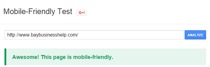
Check your own website on Google’s Mobile-Friendly Tester and see if your website gets a green check mark or a red “Uh oh”.
Google is rewarding mobile-friendly sites with slightly better placements on the search engines when a smartphone is used too.
Check Your Email
If you use an email marketing platform like Constant Contact which I’m a huge fan of, they have a ton of mobile-friendly templates that you can use to build your brand and use it to market to your audience directly.
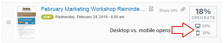
Remember the statistic above? 50% of all emails are opened on a mobile device. If your email looks awful on a mobile device, people will simply delete it or worse, unsubscribe. Constant Contact even gives you stats on how many times your emails were opened in mobile versus on a desktop/laptop, which is very important to know!
Check Your Landing Pages
If you’ve got landing pages or squeeze pages where you’re trying to get people to do something, just remember that a good portion of them will be on a mobile device. If they have to pinch and squeeze the page just to read the darned thing, they’re going somewhere else.
LeadPages is my favorite landing page tool, and all of their templates are mobile-aware. They all rearrange the content to fit the device, and they even show you how it looks in a desktop, tablet and a cell phone, right in the editor!
Given the fact that a good portion of your visitors to your website are on mobile, and if they’re interacting with Facebook posts or other social media “bait”, you need to make sure that your conversion tools work well on mobile, just as much as they do on desktop:
- Email newsletter sign-ups
- Webinar sign-ups
- Paid opt-ins to your services
- Other lead capture or “ethical bribes”
As an example, I run a series of online webinars. Here’s my landing page for the next webinar (which I hope you’ll come to by the way) [Registration is closed.]. Is it easy to sign up? That’s the point here.
Mobile Is Here to Stay
There’s no doubt about it, that mobile is here and it’s not going anywhere. A good chunk of us own more than one mobile device: a smartphone that’s always with us, and a tablet for reading or doing other things.
Review ALL your online marketing assets and collateral to make sure they are mobile-aware. If they’re not, fix them, and you’ll enjoy higher conversion rates and opt-ins.
Oh, and if you’re near Livermore, I hope you’ll come out to my next workshop: Harness the Power of Mobile to Grow Your Business. It’s on Thursday, March 17 at 11:30 a.m. [Note: Registration is closed.] Please bring your lunch, your business cards (to network!) and your questions.
(This original article was written by Thomas Petty, originally appeared here and was re-published with permission.)